THE GEA HEADQUARTERS AS A BRANDED SPATIAL EXPERIENCE
GEA Group Aktiengesellschaft is a German, internationally operating mechanical engineering company listed in the DAX 40, with 18,000 employees worldwide, more than 250 operational subsidiaries and a history spanning over 100 years, which began in Bochum.
The task was to develop a company-owned spatial working culture in GEA’s new Düsseldorf corporate headquarters for around 400 employees, closely linked to GEA’s strong brand values.
Across some 7,000 m², these brand values now take shape in space – primarily through GEA’s brand colours and the distinctive “Key Visuals” – offering employees identification, creating a sense of belonging, and at the same time bringing visitors and external staff closer to the heart of the Group.
GEA’s primary brand colours are a deep dark blue, an intense ultramarine, and the neutral tones light grey and white.
They zone the four-storey building through ceilings, walls and floors according to function, and define the respective atmospheres in terms of colour psychology.
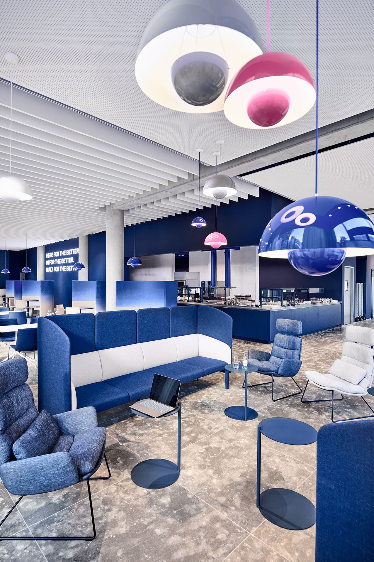
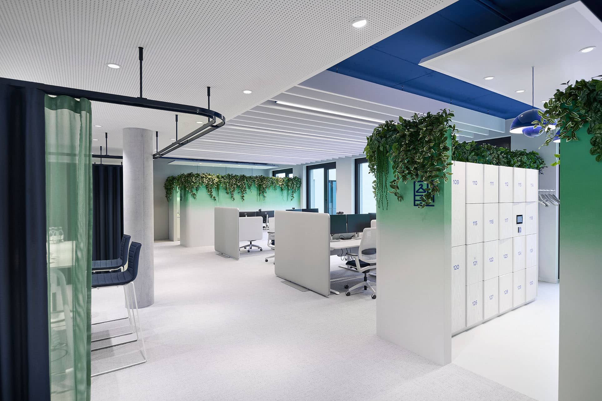
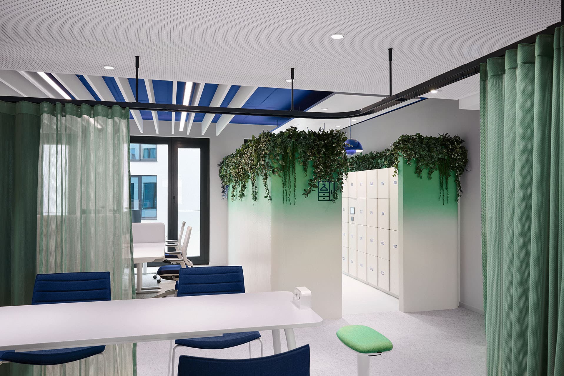
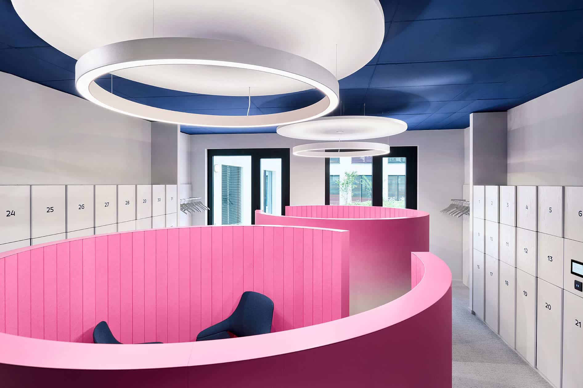
The guiding colours are complemented by the luminous secondary brand colours pink and green, appearing as accents and gradients. These are derived from the central branding motif “Sunrise” – a morning mood in which the landscape seems to merge into the sky.
It stands for daily new beginnings and the company’s constant change.
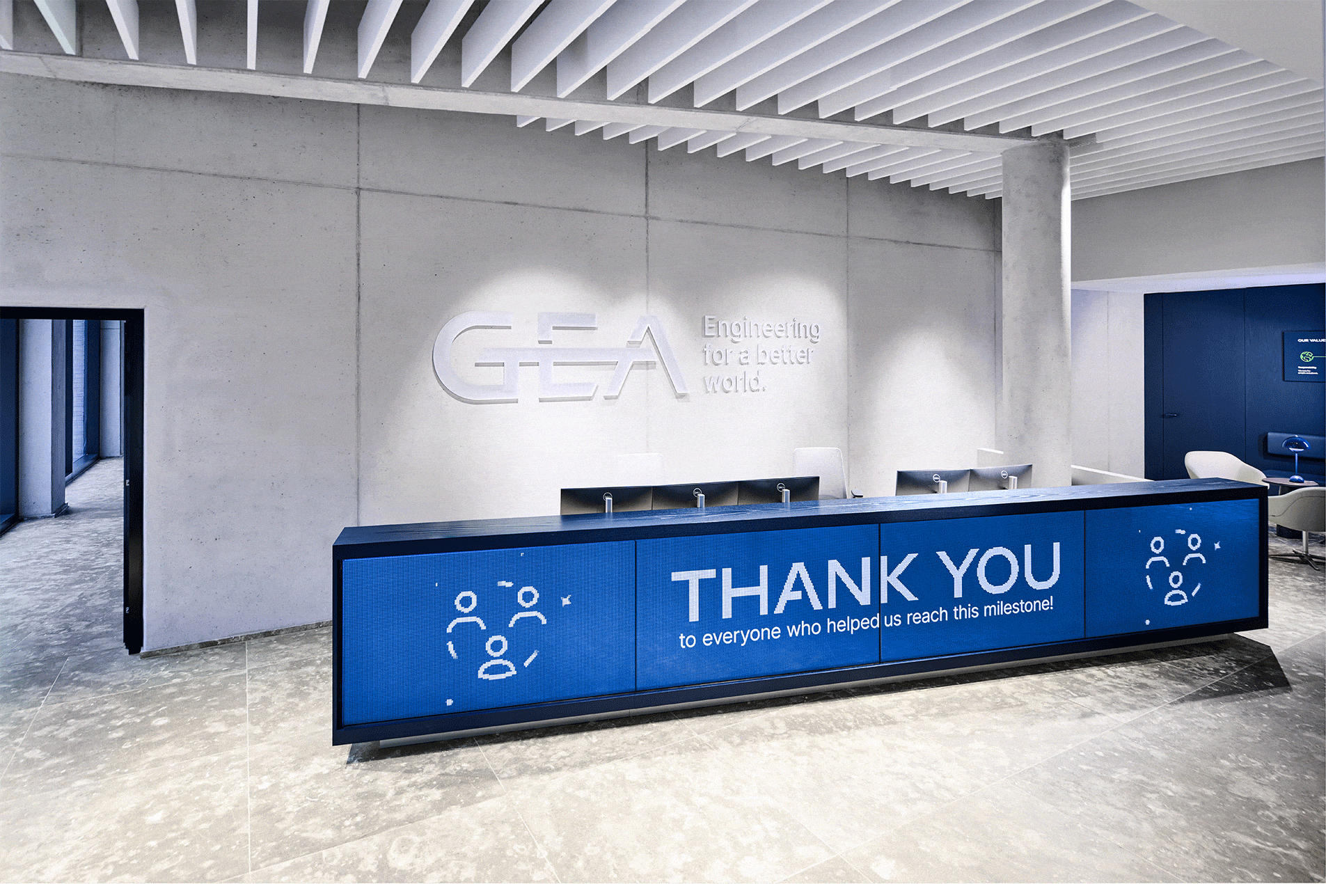
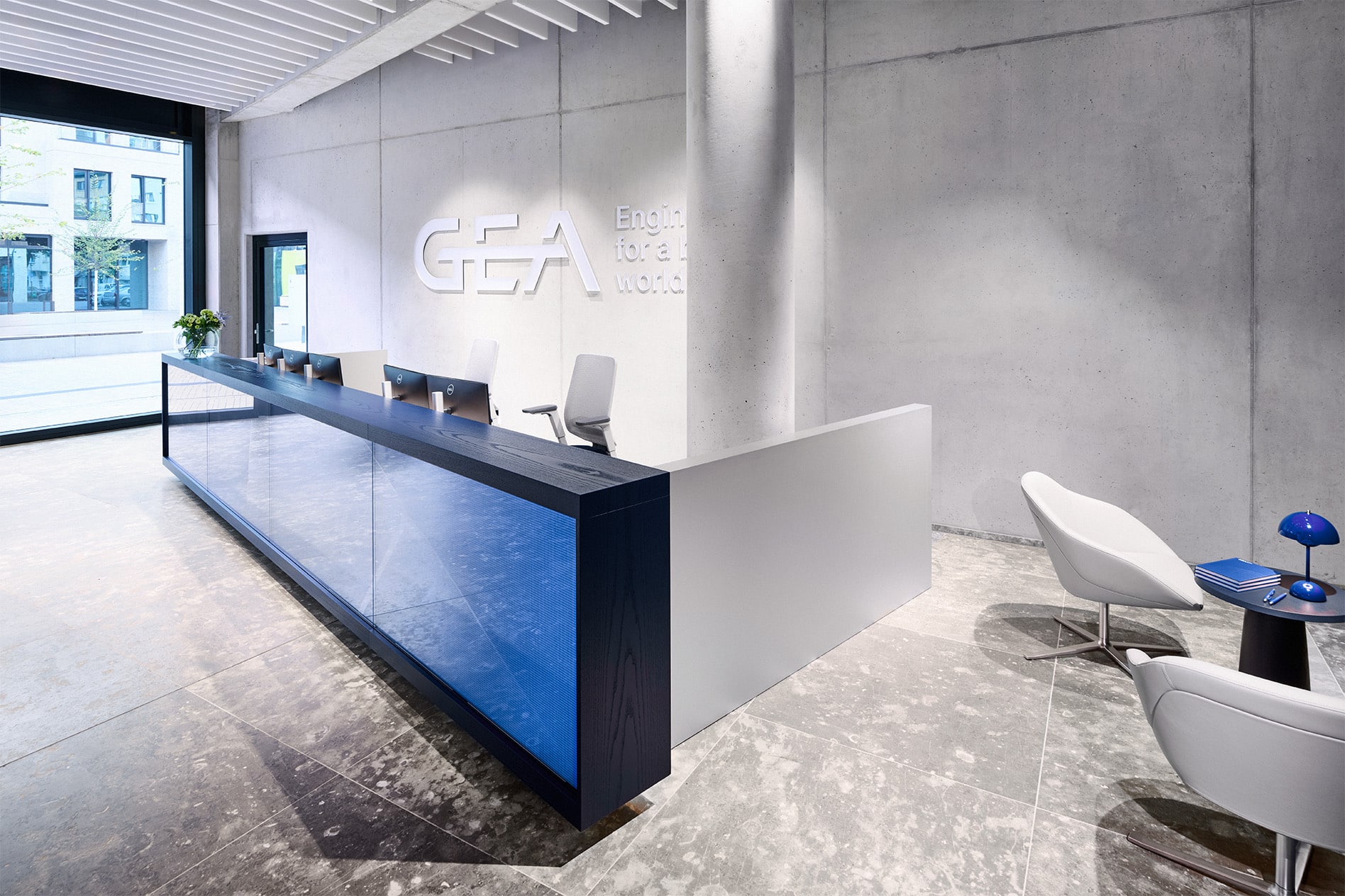
The ground-floor entrance area is already staged as a brand gesture:
a digital reception desk makes GEA newly tangible time and again through its dynamic content.
The translucent GEA logo – inseparably linked to its claim “ENGINEERING FOR A BETTER WORLD” – is positioned on the rear exposed-concrete wall and subtly underscores the brand’s philosophy and positioning as a central message.
In addition, the analogue Brand Values in the adjacent waiting lounge complete the branded space.
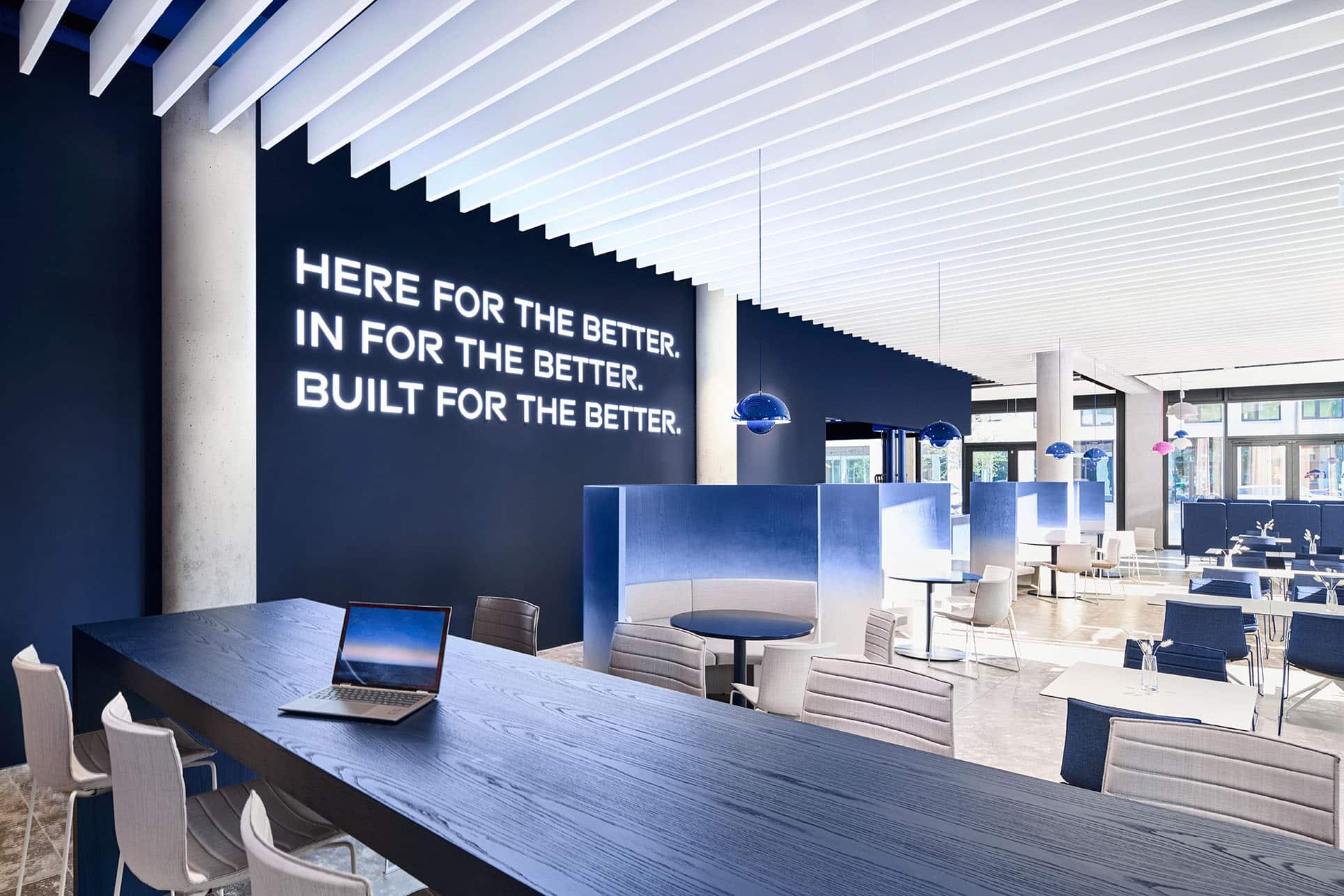
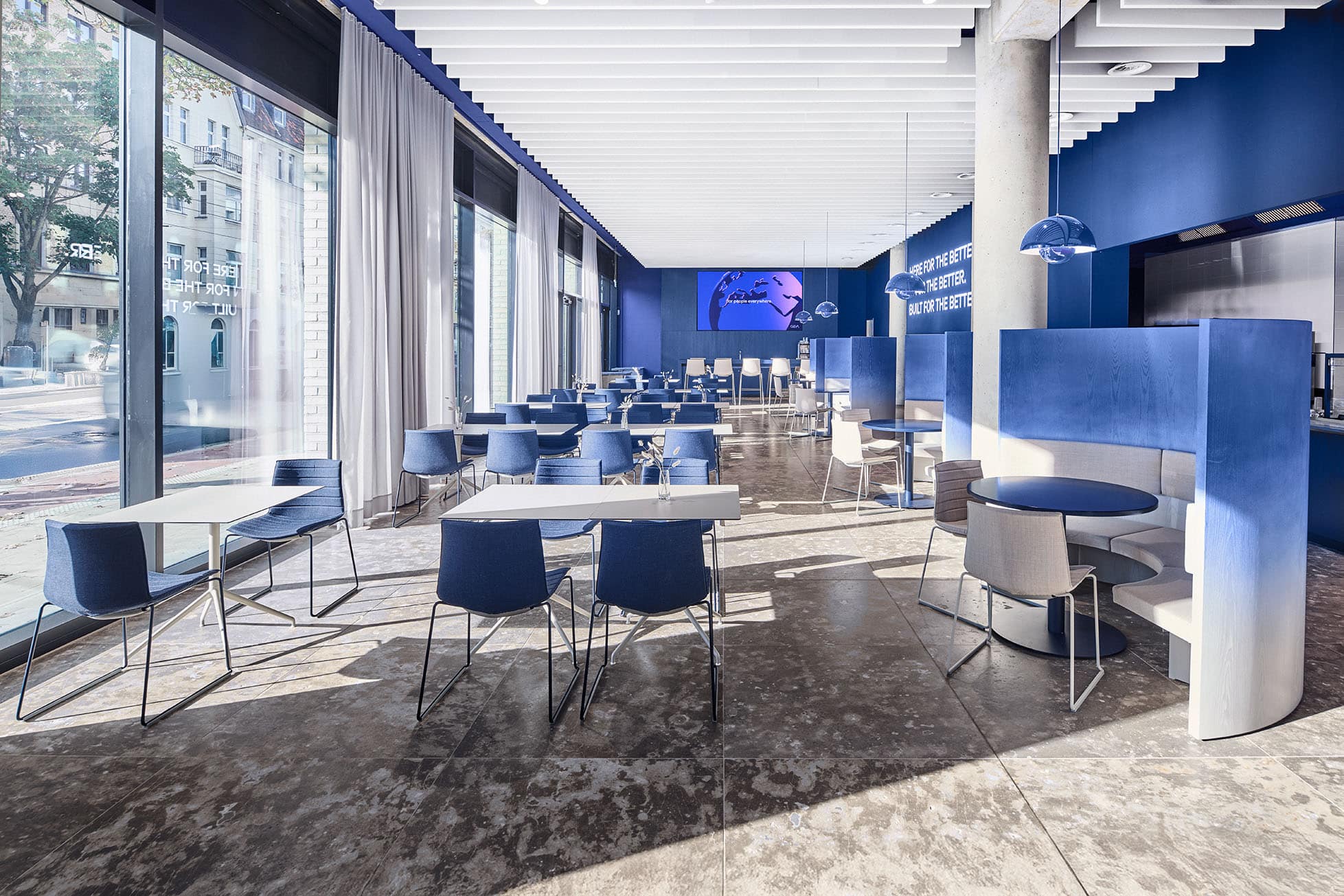
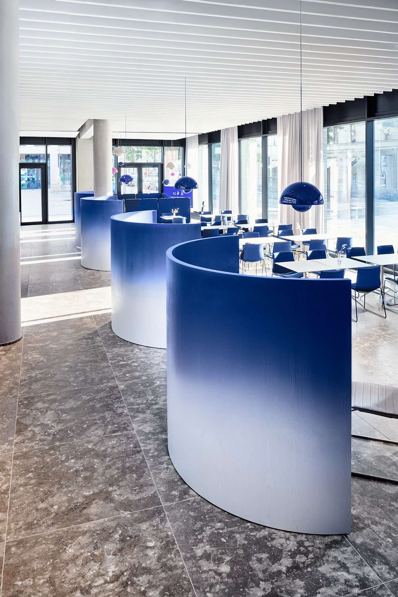
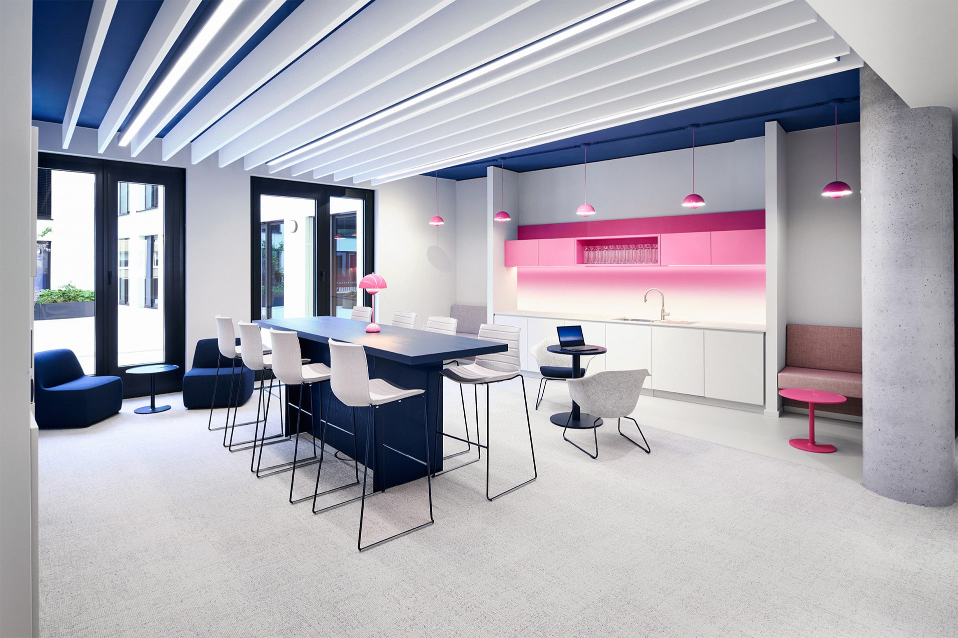
The staff restaurant that follows directly on forms a special social hub. It visually brings together all aspects of GEA-specific interior architecture and, through varied seating and stay options, provides a place for encounter, relaxation and lively exchange.
Here too, the brand is ever-present: a glowing lettering with the claim “HERE FOR THE BETTER, IN FOR THE BETTER, BUILD FOR THE BETTER”, combined with the characterful colours of the interior fit-out, creates an identity-forming sign and, through the open glass façade, radiates into the neighbouring urban realm.
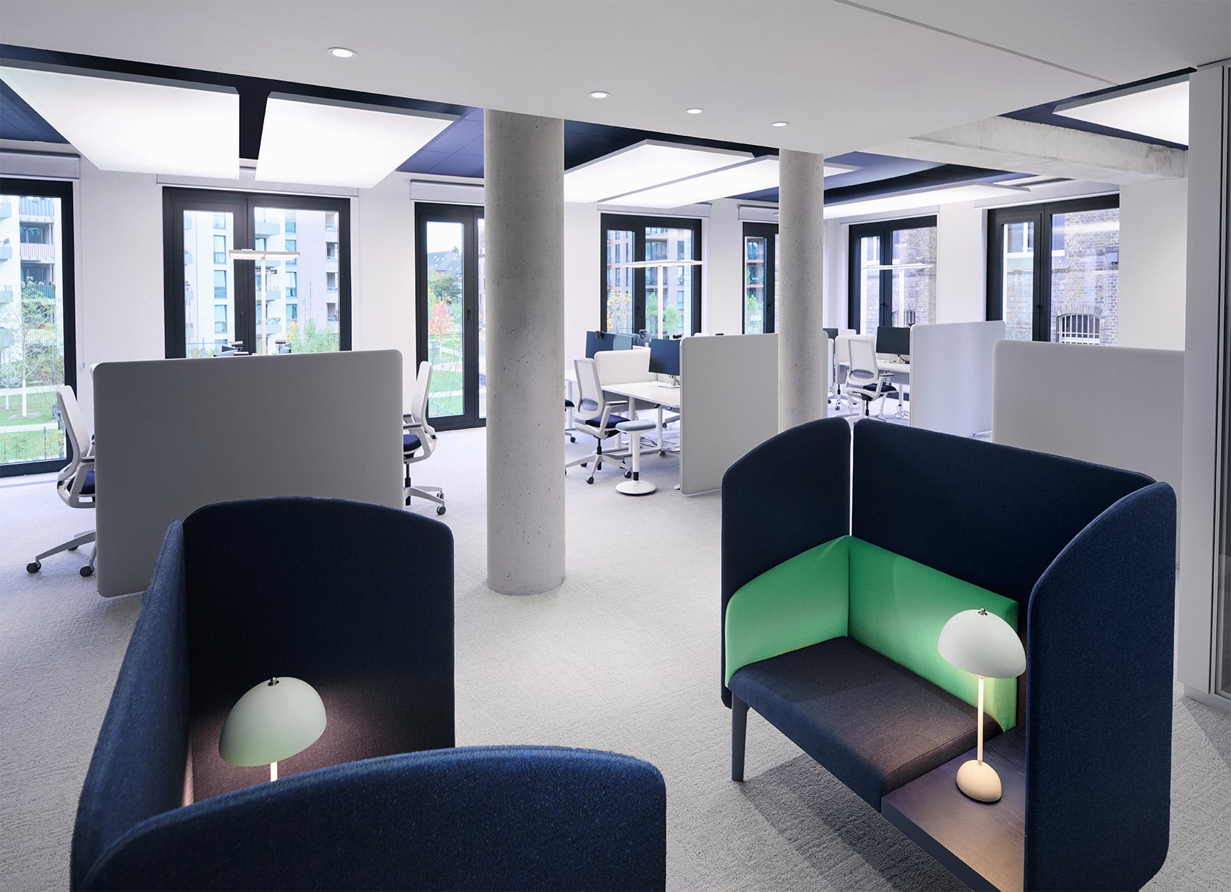
Especially in the work areas, the colour distribution system provides a clear backdrop for the different working worlds:
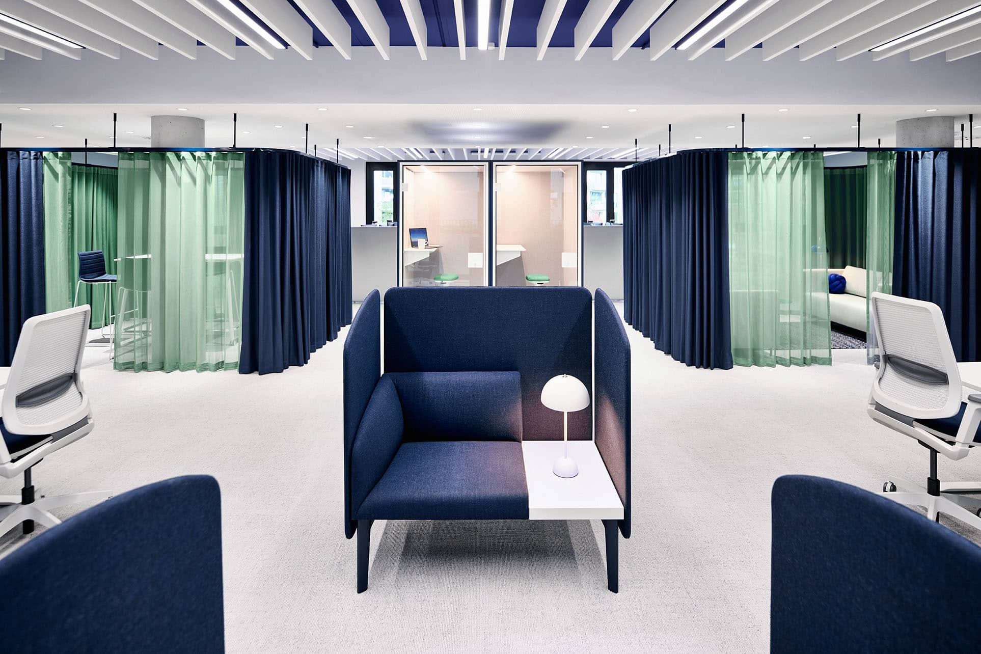
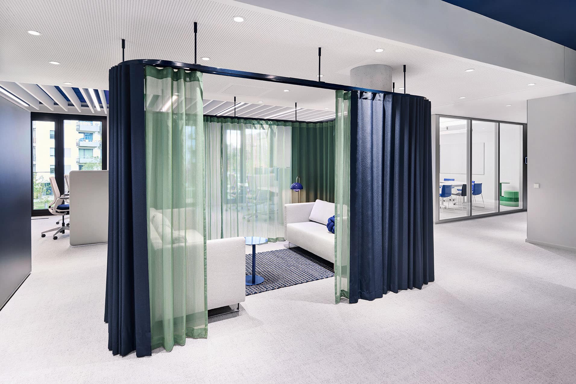
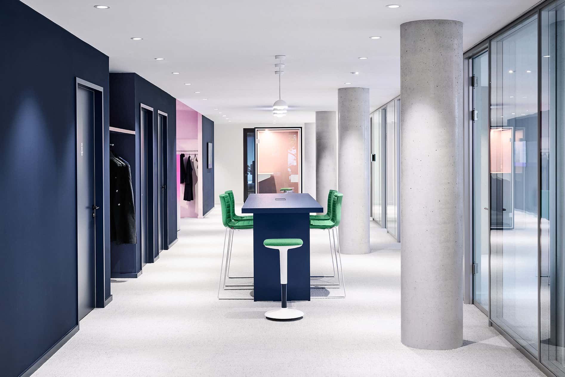
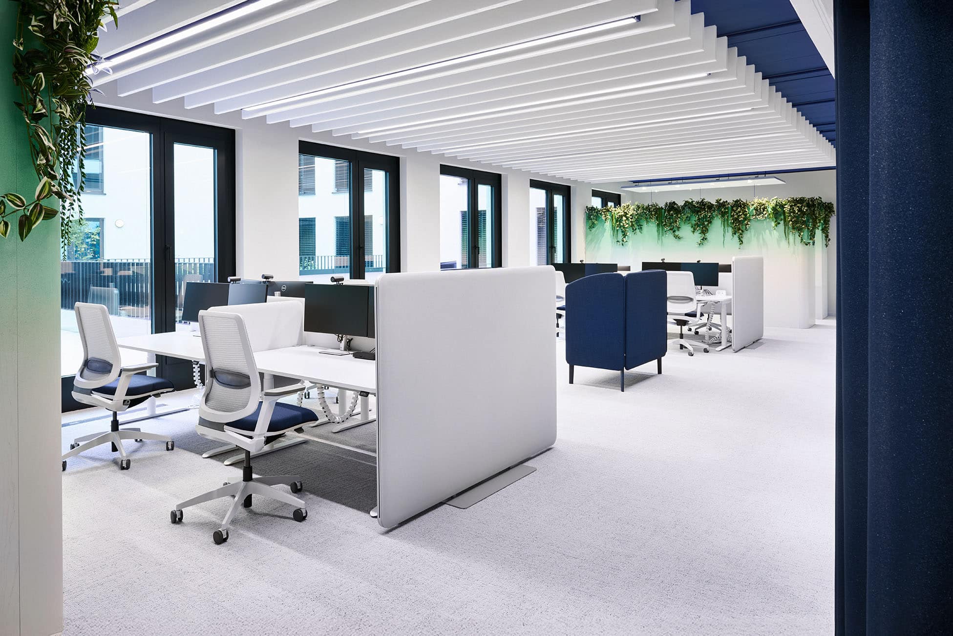
the walls and doors of the circulation and functional cores form a calm, homogenous background in dark blue.
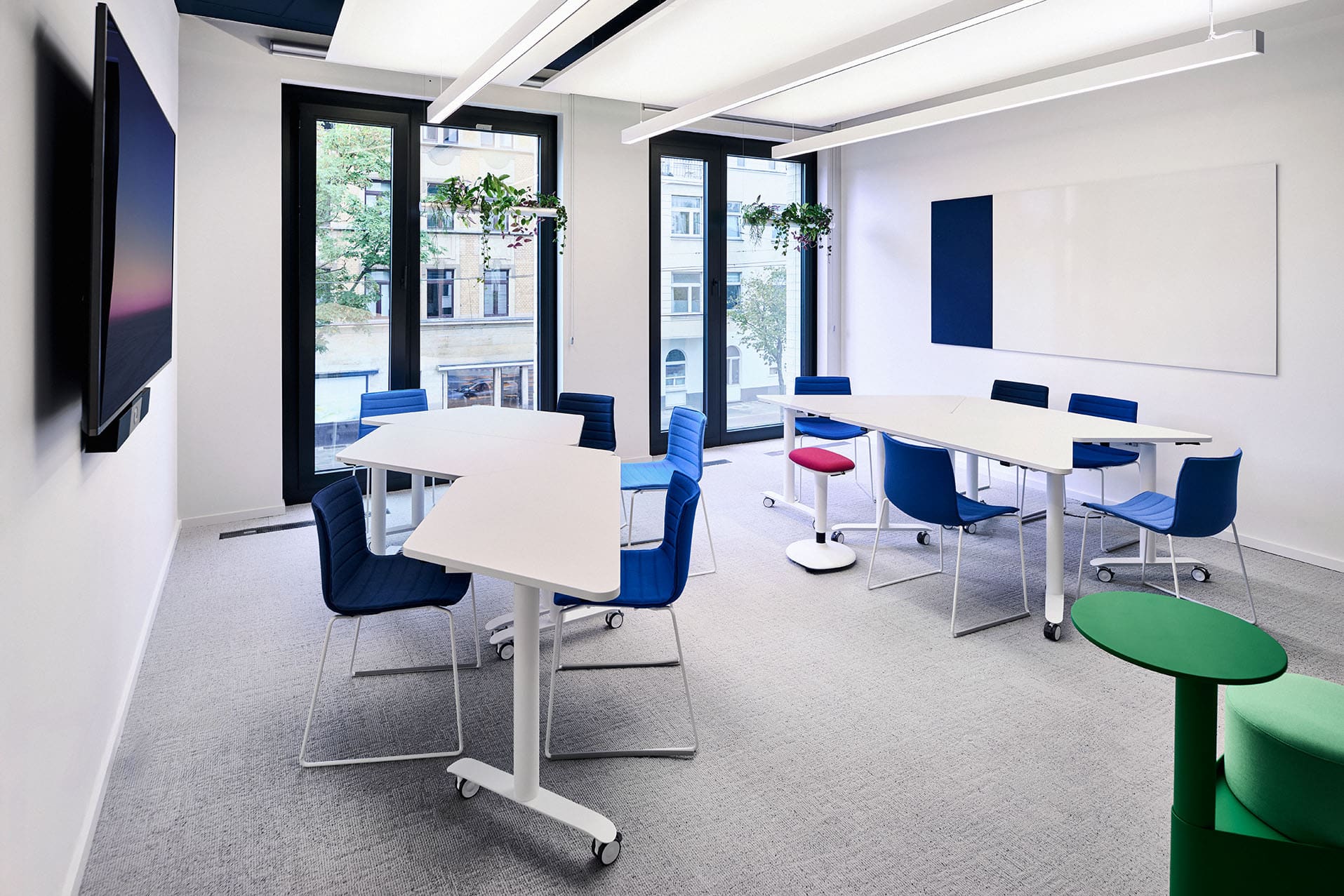
Partition walls between individual areas are kept in crisp white, while the outer façade walls in soft light grey ease the contrast to the dark grey exterior.
In the various work areas, the rough exposed-concrete ceilings are painted blue.
Their respective colour intensity is pushed into the background by suspended white acoustic ceiling elements, yet still subtly influences the spatial mood.
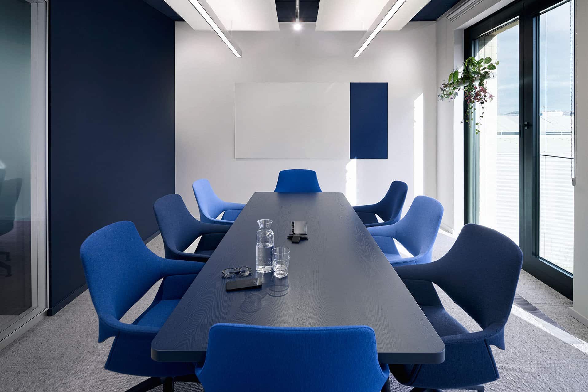
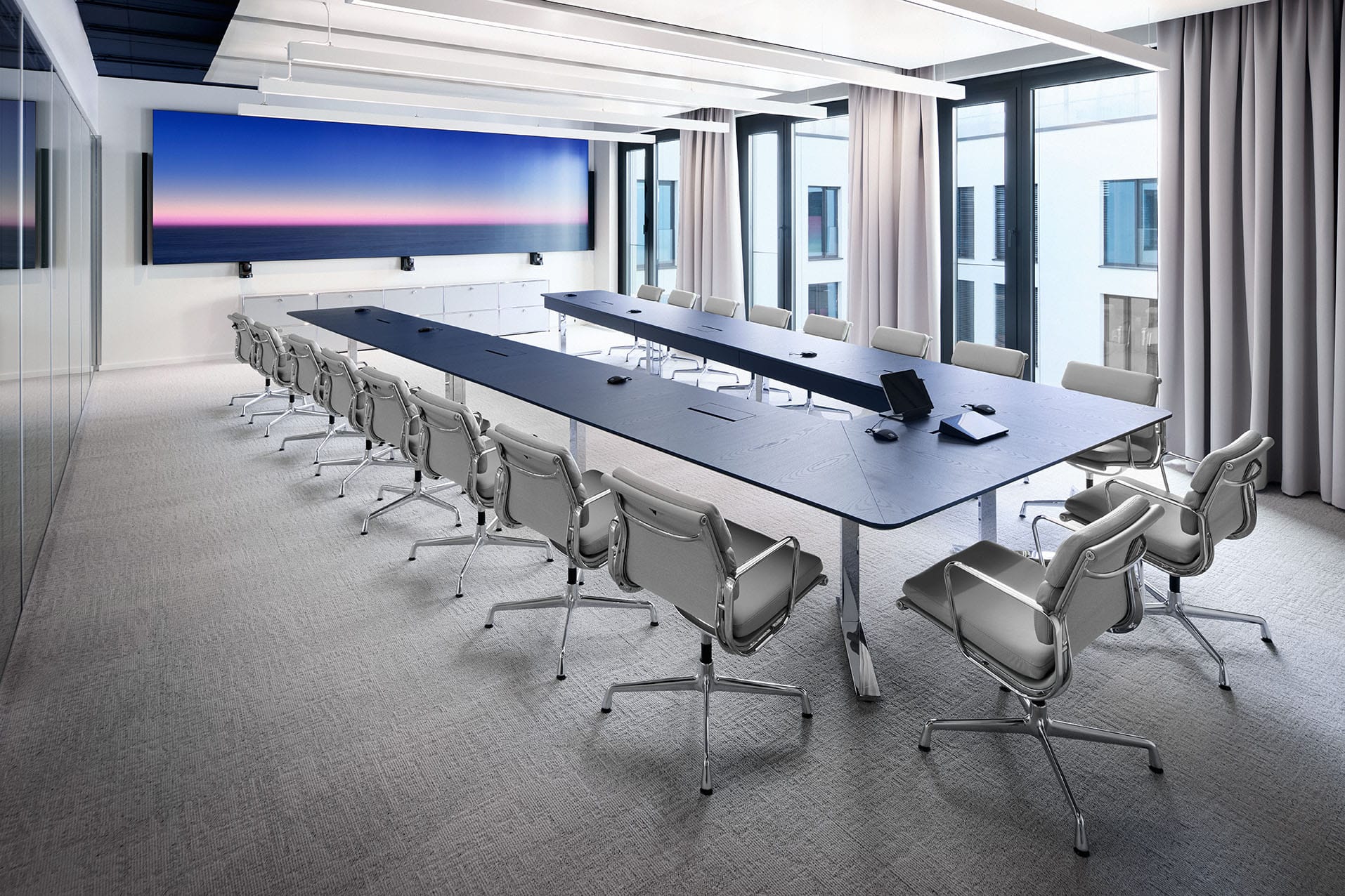
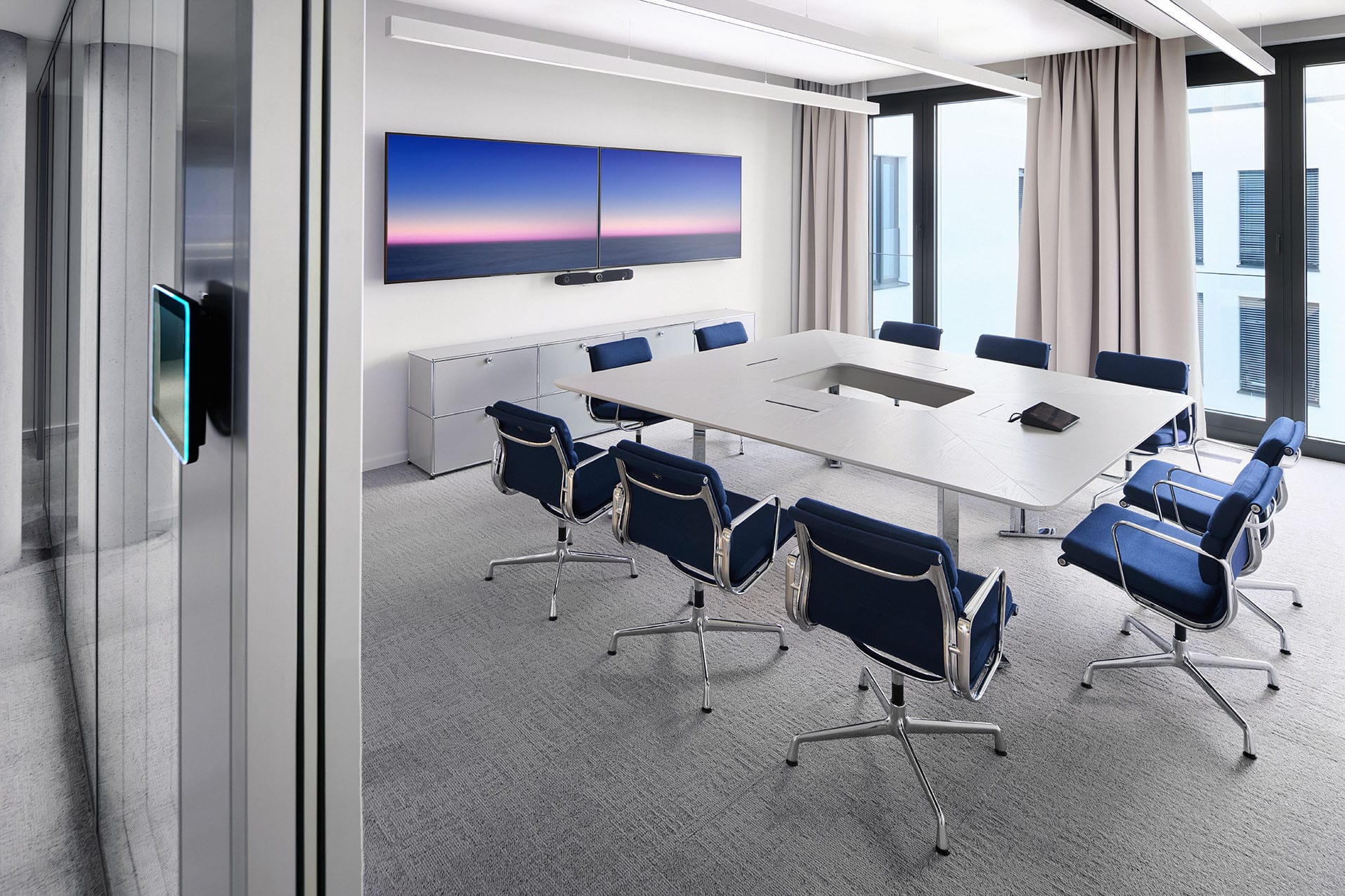
Cell offices, separated by full-height glass partitions, sit in the dark blue, more contemplative zones; the open-plan areas, by contrast, are shaped by the active ultramarine.
The workstations themselves are designed as restrained zones of concentration in pale greys and whites, forming a quiet, clear base on the light grey carpet.
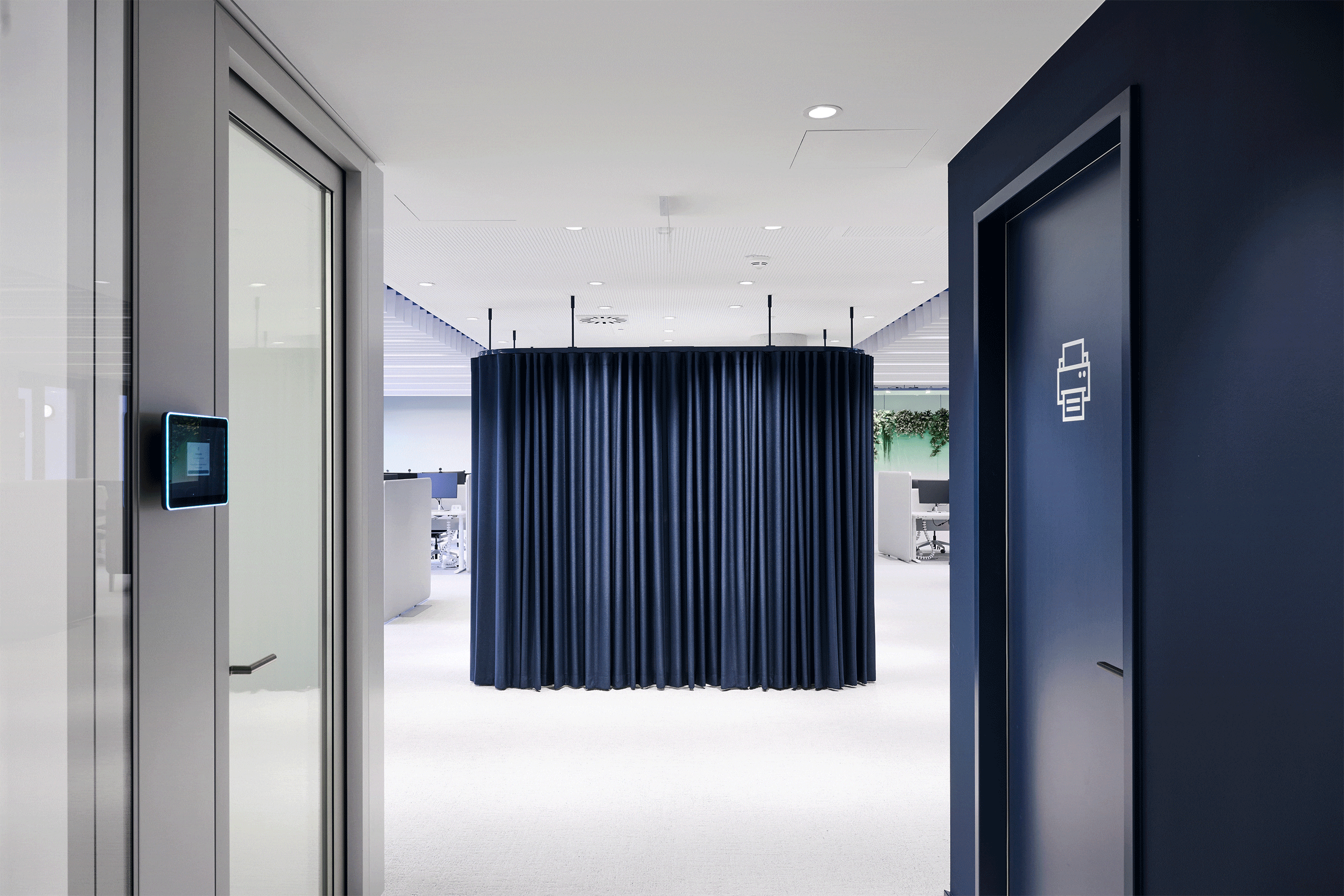
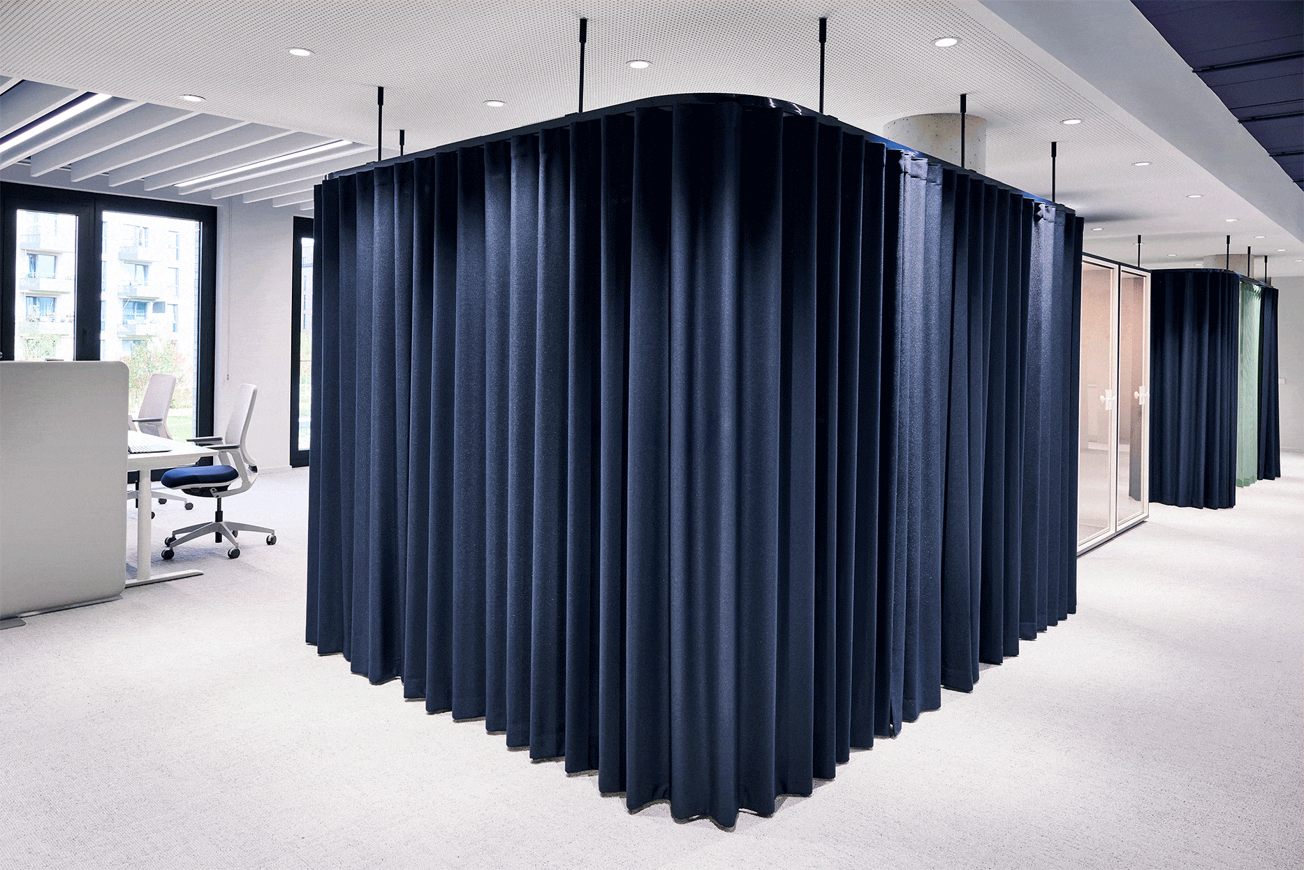
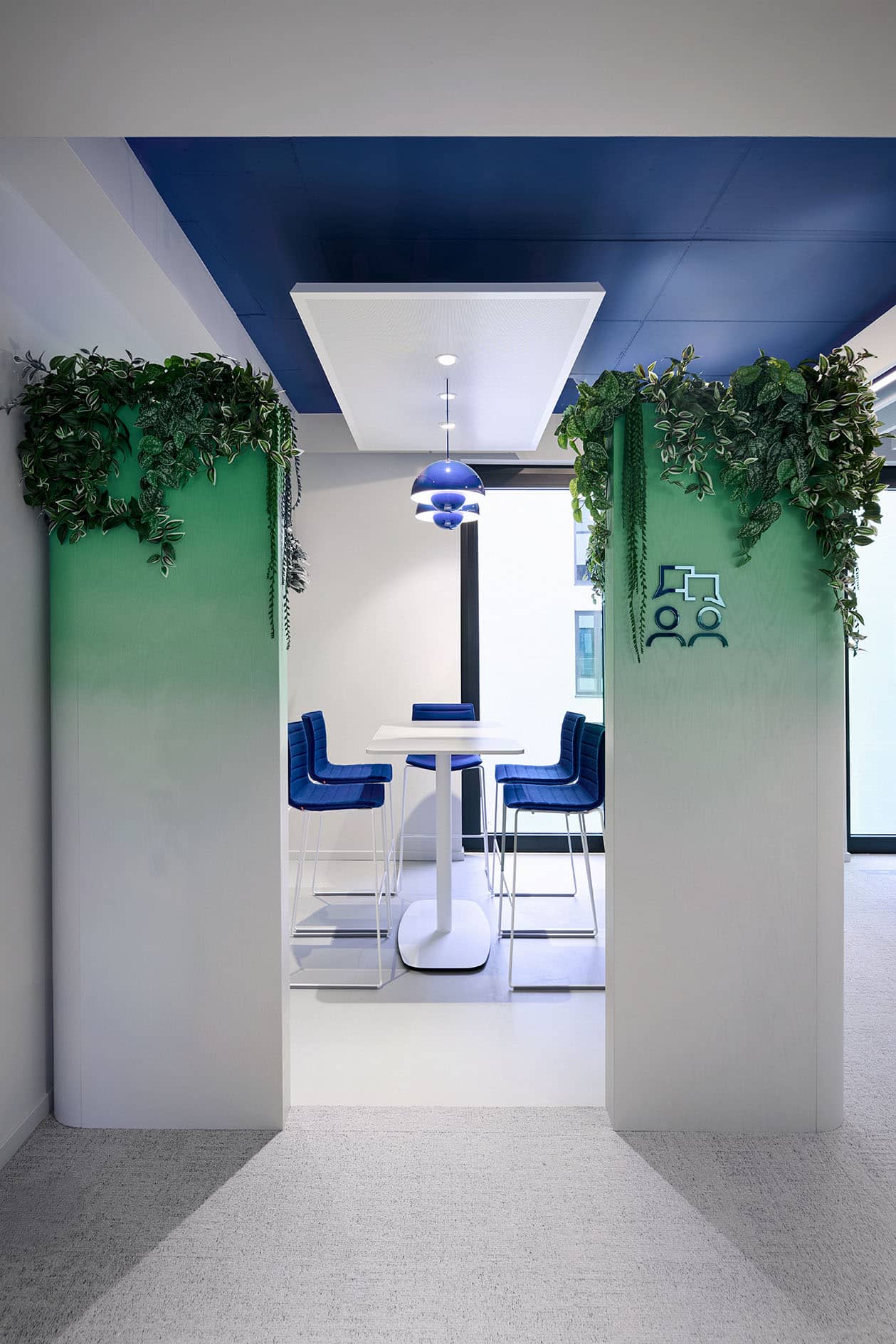
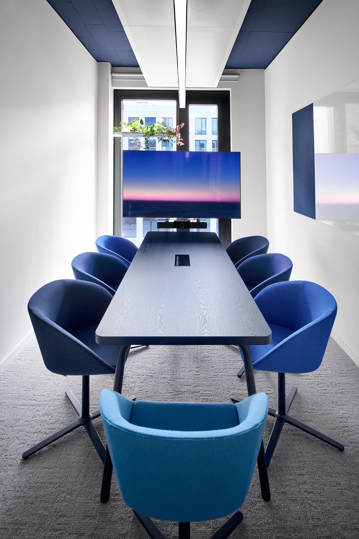
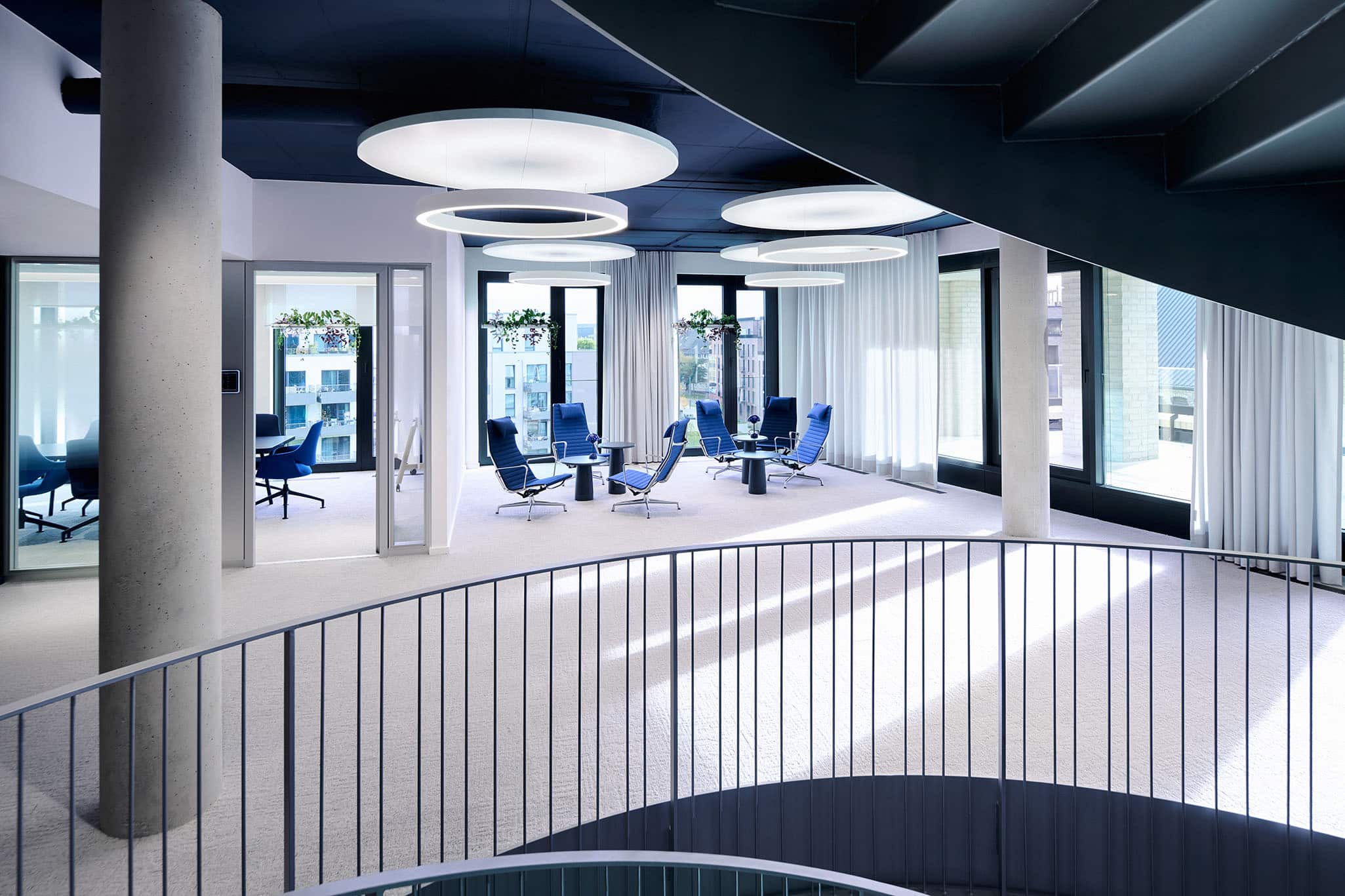
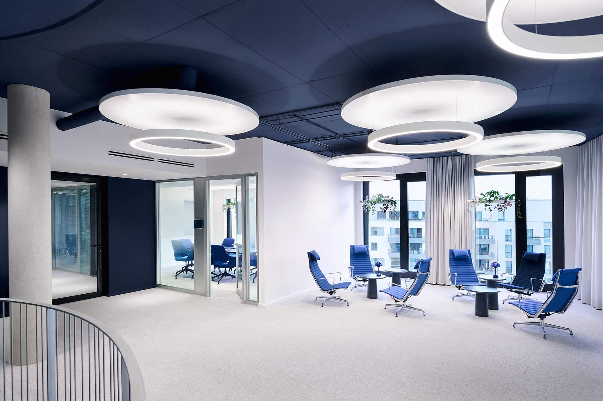
The versatile open spaces are complemented by collaboration and retreat rooms, meeting areas and communicative in-between zones, so that a wide range of working styles naturally function side by side.
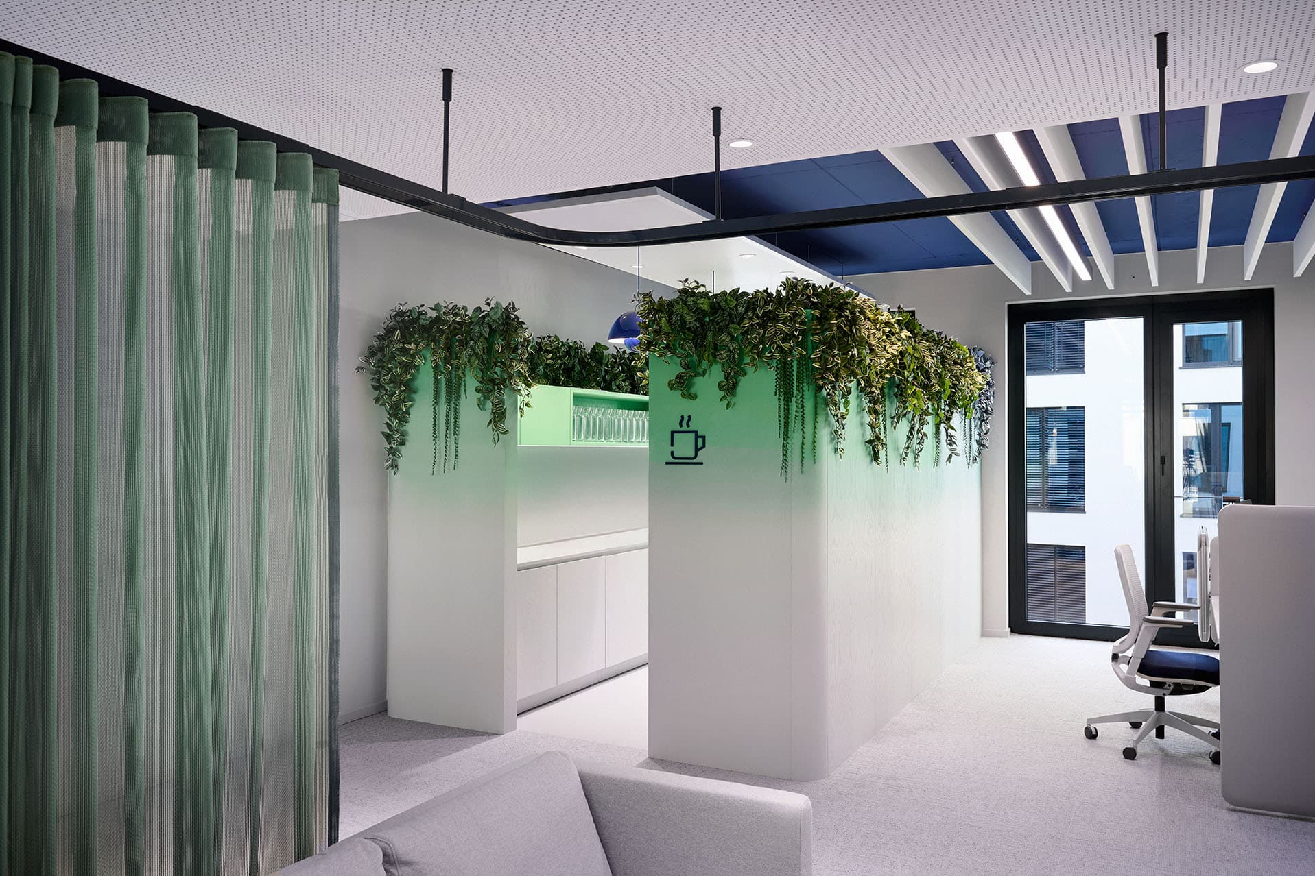
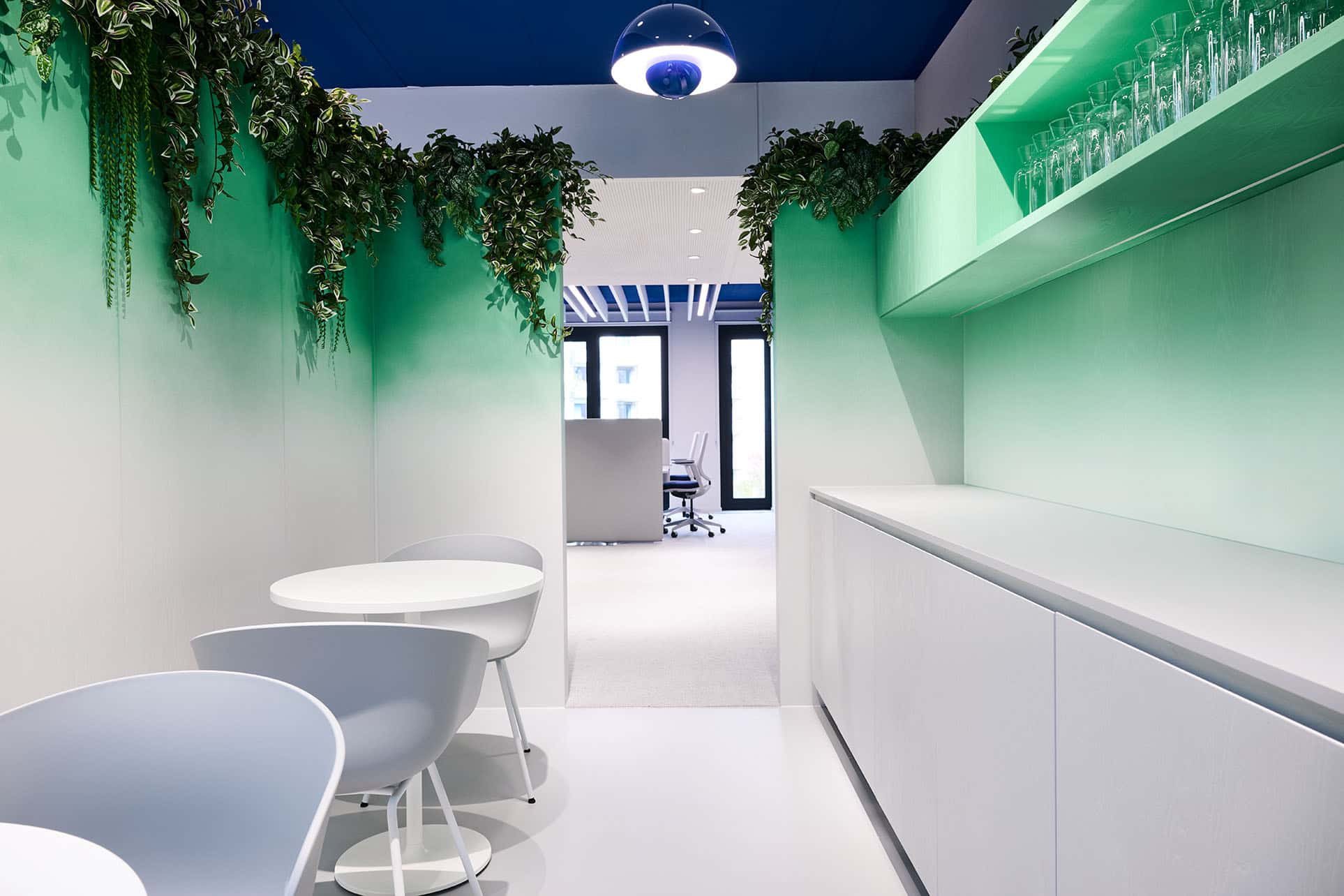
Through material changes and colour gradients in the secondary brand colours pink and green, the interior fit-out makes different uses distinctly tangible.
Open tea kitchens, with tinted real-wood surfaces, integrated planting and varied seating, act as lively room-within-a-room modules, setting special accents in the working day and combining functionality with quality of stay.
Short distances, open structures and shared places foster dialogue, innovation and team spirit, strengthening a culture of collaboration shaped by transparency and exchange.
For GEA, sustainability is strategically embedded. The goal is to achieve net-zero emissions across the entire value chain by 2040. The interior design sought to follow this ambition as well: a concept geared towards durability, together with precise, high-quality detailing and workmanship, addresses both economic and ecological requirements. The use of partly already recycled materials and separable building components would allow for later recycling.
Almost all production took place locally, keeping transport routes short and reducing energy demand and emissions. In this way, form, material choice and functional processes work closely together in the spirit of sustainable interior architecture.
In this way, the new corporate headquarters of GEA Group AG becomes a place that brings together the company’s attitude and the diverse working day shaped by its brand values in a clear, harmonious overall picture.